
What is this? I was surprised by my friends reactions when I traveled solo to China. I was either stupid brave or my marriage was falling apart. I want to prove that I am neither stupid nor heading for divorce and that we are in the year of our Lord 2018. That a woman can be married, travel solo to parts unknown and even travel back with something magical. Perhaps a camera full of beautiful smiles.
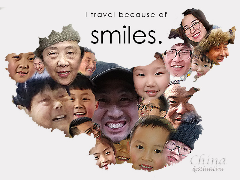
I worked with Photoshop to create this graphic. Starting with image selection and editing. Using the pen and path method with a 5-10px feather I applied the teachings of Gestalt Theory (Wikipedia, 2018). Each image was renamed as its own layer. I then created a China map (File: China, 2014) layer isolating just the outline with the pen and path method. Placed the faces over the map layer using transform rotate when needed.
With a 12px with 35% opacity eraser I then cleaned around faces to remove sharp edges. When map was covered. I grouped and merged layers of faces only. I then applied a clip mask to create the final graphic. Final process was attaching a crosshatch filter with stroke length of 5, bevel and embossed contour effect. And added the text with Century Gothic and Lucida Calligraphy. I did not wish to distract from message, so I chose to keep China destination text subtle with a beveled embossed white bold print.
The desire was to keep the appearance of simplicity.
Simple as a smile.
References
Wikipedia cpntributors. (2018, September 5). Gestalt psychology. In Wikipedia, The Free Encyclopedia. Retrieved September 6, 2018, from https://en.wikipedia.org/w/index.php?title=Gestalt_psychology&oldid=858173011
File: China provinces Anhui.png (2014, December 6). Wikimedia Commons, the free media repository. Retrieved September 6, 2018 from https://commons.wikimedia.org/w/index.php?title=File:China_provinces_Anhui.png&oldid=141617339

Emily,
This graphic was amazingly creative! I loved that you put the pictures in the shape of China, as well as the different effects you used on the faces. These effects drew my eyes to what you wanted to portray through your message–their smiles. I think you did a great job as well of using proximity and white space to draw the eye to the main event. I like that it wasn’t so busy my eyes didn’t know where to look.
2 areas for improvement–I think your image will be even more powerful if you have the image at the top of the page. I would then place ‘I travel because of smiles’ at the bottom left or right of the page (with the logo somewhere on the same side). I think this will establish the principle of hierarchy a little stronger, as the eyes will be drawn to the biggest part of the graphic (the picture), then the second largest (the motto), and then the logo. I would have to see it to know if it actually looks better, but I’ll just have to trust in Gestalt with this one 🙂
Overall, you did a great job of portraying your message and theme clearly and effectively. Great job!
LikeLike
Hi Emily,
As someone who has never traveled alone, I am envious of your free-spirit. It can be daunting to travel alone as a female to a place that you’ve never been before. That’s why your subject for this semester is such a dynamic one, because it’s centered around your experiences as well as supporting other’s in their travelling pursuits. When you see someone else doing things, it encourages you to get out and try as well!
Your graphic, at first glance I was slightly unsure what the overall message was that you were trying to convey to your audience. I didn’t pick up on the shape of the images representing people’s smiles was actually a map of China until I read what you wrote about your process. With the people smiling it comes across more like an advertisement one may see in a doctor’s office rather than a travel brochure.
The color scheme is a little sterile as well, which is why it reminded me of a doctor’s office because you always see those posters of people smiling, and it’s always over a very stark white background. I would suggest adding a subtle color effect, maybe a color that represents China! I would also suggest that you make it more clear what your message is with the graphic, remember that it’s telling a story and what you want people to know about that story is important.
I really liked what you did with the feathering of the people’s faces. I bet it was pretty tedious adding them in one layer at a time but that meticulous attention to detail gave your piece a great effect. Plus, it’s super creative to use the people to create a map of China, something I don’t think I would have considered. That definitely gives me inspiration for my own piece.
Best,
Miranda!
LikeLike
Hi Emily,
What an inspiring blog topic! I love to travel, but so far haven’t worked up the courage to do so on my own. Now that I know your blog exists, I’ll have to keep checking back for tips and tricks for once I finally do make the leap and travel solo.
Your graphic is beautiful. I love that you used the principle of similarity and proximity with the images of smiles and faces to represent such the beautiful country of China. Your desired theme of simplicity is quite successful, and I like that you stuck with a muted color palette, as it brings the attention to your map, rather than competing with it.
There are a few suggestions I have that could enhance your graphic. The first suggestion I have is to brighten the face and forehead of the man wearing the hat in the middle of the graphic. Due to the bill of his hat creating a shadow, the photo is a lot darker than the other images in your graphic. It creates a bit of dissimilarity in an otherwise very similar and cohesive graphic. If the shadow on his forehead is too difficult to brighten, you could also try moving his face up to hide his hat or switching it out with one of the faces in the corners. I think the difference in darkness would be less apparent in the side of the graphic versus the middle.
My next suggestion is to use a darker font for the “China destination” text. While the white does tie in well with your color scheme, it’s a bit hard to read. The beveled and embossed effect helps with the difficulty, particularly with the word “destination,” but it’s still a bit hard to read the word “China.” It might be interesting to put “China” in a distinct color as well, to further draw the eye to the word.
I really enjoyed reading about your travels and seeing some of your photos. This graphic is a creative way to show off the beauties of your travels. I look forward to seeing the final product and hearing about more of your travels!
Best,
Jeannie
LikeLike
Thank you so much for the feedback!
When I started this piece, I had no idea where I would take it.
I have always enjoyed storytelling images over text, so I decided to use my own images to build the piece. Each of these people I personally interacted with.
I have taken note of making the “China” and “destination” text stand out, adding some color representing China to the piece, and moving the image from the top while adding the text to the bottom! I’m excited to work through this feedback and see where the process will lead.
LikeLike